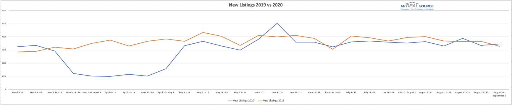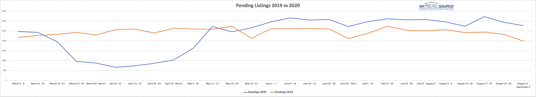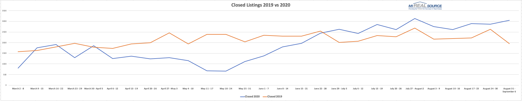
The Pandemic Curve Graphs
Check out these weekly statistics MiRealSource generates which includes New Listings, Pending Listings, and Sold Listings. The data comes directly from the MLS and includes our data sharing partners. These graphs track stats throughout the Pandemic from March 2, 2020 to the current week, plus how it compares to the same time-frame in 2019. With these graphs you can see how the pandemic has effected the market; therefore keeping you & your clients informed. Given the uncertainty of today’s times and market, these graphs are a great resource to follow.